
鸿蒙开发环境准备
HarmonyOS官网—-一探究竟—-DevEco Studio 下载
https://developer.huawei.com/consumer/cn/app
界面
ArkTS基础快速入门
ArkTS:是一门用于开发鸿蒙应用的编程语言。
编程语言:用来控制计算机工作的,可以告诉计算机我们要做的事情。
编写代码 → 编译运行 → 查看效果
认识和存储数据
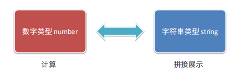
编程语言的核心是处理 数据
三种常见的基础数据类型
- string 字符串:描述信息
- number 数字:计算
- boolean 布尔:判断 (真、假)
存储数据(变量、常量)
变量:专门用来存储数据的容器
// let 变量名: 类型 = 值
let title: string = `奥利奥水果捞`
let price: number = 22
let isSelect: boolean = true
1.变量存储
字符串 string 类型
- 注意点
- 字符串需要用引号引起来(单引号双引号)’字符串’ “字符串”
- 存储的时候,后面的存的内容,需要和前面的类型对应
let title: string = `巨无霸汉堡`
console.log(`字符串title`,title)
数字number 类型
let age: number = 18
console.log(`年纪age`,age)
布尔 boolean 类型(true真,false假)
// 真
let isLogin: boolean = true
console.log(`是否登录成功`,isLogin)
// 假
let isLogin: boolean = false
console.log(`是否登录成功`,isLogin)
变量的修改
let age: number = 18
console.log(`年纪age`,age)
//修改
age = 80
console.log(`年纪age`,age)
常量:用来存储数据 (不可变)
// const 常量名: 类型 = 值
const PI: number = 123456
const companyName: string = `华为`
console.log('公司名',companyName)
console.log('PI',PI)- 变量常量的注意事项(命名规则):
- 只能包含数字、字母、下划线、$,不能以数字开头(重点)
- 不能使用内置关键字或保留字 (比如 let、const)
- 严格区分大小写
数组
数组:是一个容器,可以存储多个数据
let 数据名: 类型[] =[数据1,数据2,.....]
let names: string[] =['小红','小明','大强']注意:数组指定的类型和存储的数据类型要必须一致,否则会报错
获得数组元素: 数组名[索引]
let names: string[] =['小红','小明','大强']
console.log('取出小明',names[1])注意:索引号是从 0 开始的
函数
函数 – Function
函数:是可以被重复使用的代码块
作用:函数可以把具有相同或相似逻辑的代码“包裹”起来,有利于代码复用
// 1.定义函数
function 函数名(){
  函数体
}
2.调用函数
函数名()注意:先定义,后使用 (变量、函数都是如此)
函数的完整用法
根据我们传入不同的数据,进行处理,返回处理后的结果。
                  //形参
function 函数名(需要处理的数据) {
  编写代码对数据进行处理
  return 处理后的结果
}

let 变量名: 类型=函数名(实际要处理的数据)
                         // 实参
箭头函数
箭头函数是 比普通函数 更简洁 的一种函数写法
let 函数名() => {
  // 函数体
}
函数名()

let 函数名 = (形参1:类型,形参2:类型) => {
  // 函数体
  return 计算的结果
}
函数名(实参1,实参2)普通函数和箭头函数,在后面开发中会有不同的使用场景,
所以两种语法都需要掌握
对象
作用:用于描述一个物体的特征和行为
对象:是一个可以存储多个数据的容器
定义&使用
let 对象名称: 对象结构类型 = 值
通过 interface 接口约定 对象结构类型
//语法
interface 接口名{
  属性1: 类型1
  属性2: 类型2
  属性3: 类型3
}
interface Person{
    name: string
    age: number
    weight: number
}
定义对象并使用(通过 . 访问)
let person: Person = {
  name: '某某某',
  age: 19,
  weight: 99
}
console.log('名字', person.name)
console.log('年纪', person.age)
console.log('体重', person.weight)
对象 – 方法
方法作用:描述对象的具体行为
约定方法类型
// 语法
interface 接口名称{
  方法名:(参数:类型) => 返回值 类型
}

interface Person{
  dance: () => void
  sing: (song: string) => void
}添加方法(箭头函数)
let ym: Person ={
  dance: () => {
    console.log('某某说','我来干什么')
  }
  sing: (song: string) => {
    console.log('某某说','我来干嘛',song)
  }
}
ym.dance()
ym.sing('啥哈哈')
联合类型
联合类型是一种灵活的数据类型,它修饰的变量可以存储不同类型的数据。
// 语法
let 变量: 类型1 | 类型2 | 类型3 = 值

let judge: number | string = 100
console.log('A',judge)基于联合类型,变量可存不同类型数据
枚举类型
枚举类型是一种特殊的数据类型,约定变量只能在一组数据范围内选择值
定义枚举类型(常量列表)
// 语法
enum 枚举名{
  常量1 = 值,
  常量2 = 值,
  ........
}
enum ThemeColor{
  Red = '#ff0f29',
  Orange = '#ff7100',
  Green = '#30b30e'
}
使用枚举类型,约束变量
enum ThemeColor{
  Red = '#ff0f29',
  Orange = '#ff7100',
  Green = '#30b30e'
}

let color: ThemeColor = ThemeColor.Red
console.log('主题颜色',color)
界面开发起步
开发工具:仍然是 DevEco Studio
学习界面开发:build 里面写代码,预览器 看效果
界面开发-布局思路
ArkUI(方舟开发框架)是一套 构建 鸿蒙应用 界面 的框架
构建页面的最小单位就是 “组件”
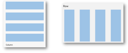
组件分类:
① 基础组件:界面呈现的基础元素。
如:文字、图片、按钮等。
② 容器组件:控制布局排布。
如:Row行、Column列等。
布局思路:先排版,再放内容
组件语法:
①容器组件:行Row、列Column
容器组件(){
  //内容
}
// 例子
build(){
Column(){
Text('小说简介')
Row(){
text('都市')
text('生活')
text('情感')
text('游戏')
}
}
}组件的属性方法
需求:美化组件外观效果 → 组件的属性方法
组件() {}
   .属性方法1(参数)
   .属性方法2(参数)
   .属性方法3(参数)
   ......

//例子
Text('小说简介')
  .height(40)
  .fontSize(20)
.....| 组件属性方法 | 描述 |
| .width(200) | 宽度 |
| .height(200) | 高度 |
| .backgroundColor(Color.Pink) | 背景色 |
| .fontSize(24) | 字体大小 |
| .fontWeight(FontWeight.Bold) | 字体粗细 |
字体颜色
语法:.fontColor(颜色值)
| 颜色值说明 | 具体演示 |
| 枚举颜色 Color.颜色名 | Color.Red、Color.Pink |
| #开头的16进制 | ‘#df3c50’ 【设计图会标注】 |
Text('小说简介')
        .fontColor(Color.Orange)
        .fontColor('#df3c50')
提示:色值 也能在 其他写颜色 的属性方法中使用,如:背景色
文字溢出省略号、行高
1. 文字溢出省略 (设置文本超长时的显示方式)
          // 语法
          .txexOverflow({
            overflow:  TextOverflow.XXX
          })
注意:需要配合 .maxLines(行数) 使用
2. 行高
          // 语法
          .lineHeight(数字)
Image 图片组件
作用:界面中展示图片
支持 网络图片资源 和 本地图片资源
    // 语法
    Image(图片数据源)
    Image(‘https://www.itheima.com/images/logo.png’)
    Image( $r('app.media.文件名') )
Column() {
Image($r('app.media.product'))
Text('耐克龙年限定款!!!')
Row() {
Image($r('app.media.avatar'))
Text('令人脱发的代码') } }输入框 与 按钮
    TextInput(参数)
      .属性方法()
    Button('按钮文本')
1. 参数:placeholder 提示文本
TextInput({
placeholder: '占位符文本' })
2. 属性:type(InputType.xxx) 设置输入框 type 类型
| type 值 | 解释说明 |
| ① Normal | 基本输入模式,无特殊限制 |
| ② Password | 密码输入模式 |
案例
Column({space: 10}){
TextInput({
placeholder:'清输入用户名'
})
TextInput({
placeholder:'请输入密码'
}).type(InputType.Password)
Button('登录')
.width(200)
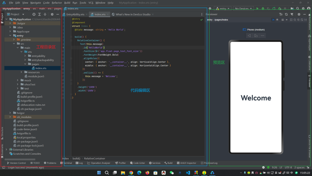
}综合实战 – 登录
@Entry
@Component
struct Index {
  @State message: string = 'Hello World';

  build() {
    Column({space: 15}){
          Image($r('app.media.img1'))
            .width(50)
          TextInput({
            placeholder:'请输入用户名'
          })
          TextInput({
            placeholder:'请输入密码'
          }).type(InputType.Password)
          Button('登录')
            .width('100%')
          Row({space: 105}){
            Text('前往注册')
            Text('忘记密码')
          }
        }
        .width('100%')
        .padding(20)
    }
}
设计资源-svg图标
可以使用 svg 图标(任意放大缩小不失真、可以改颜色)
使用方式:
1. 设计师提供:基于项目设计的图标,拷贝到项目目录使用
2. 图标库中选取:找合适的图标资源 → 下载(svg) → 拷贝使用
Image($r('app.media.ic_dianpu'))
.width(40)
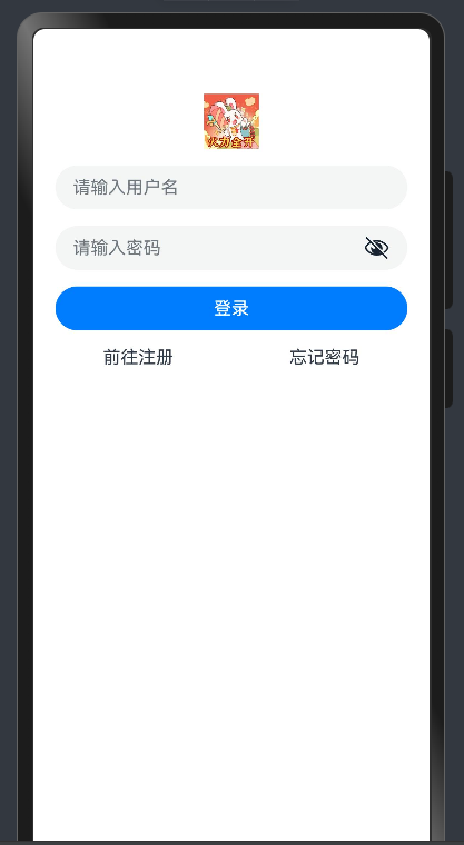
.fillColor('#b0473d')布局元素的组成
内边距 padding
作用:在 组件内 添加 间距,拉开内容与组件边缘之间的距离
    // 语法
    Text('内边距padding')
      .padding(20)
    // 例子
    Text('内边距padding')
      .padding({
        top: 10,
        right: 20,
        bottom: 40,
        left: 80
      })
外边距 margin
作用:在 组件外 添加 间距,拉开两个组件之间的距离
// 语法
Text('外边距margin')
.margin(20)
// 例子
Text('外边距margin')
.margin({
top: 10,
right: 20,
bottom: 40,
left: 80
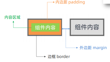
})QQ音乐登录-案例
@Entry
@Component
struct Index {
  @State message: string = 'Hello World';

  build() {
      Column(){
        Image($r('app.media.img1'))
          .width(100)
        Text('火力全开')
          .fontWeight(700)
          .margin({
              top:10,
              bottom: 40
          })
        Button('QQ登录')
          .width('100%')
          .margin({
            bottom:10
          })
        Button('微信登录')
          .width('100%')
          .backgroundColor('#ddd')
          .fontColor('#000')
      }
      .width('100%')
      .padding(20)
    }
}
边框 border
作用:给组件添加边界,进行装饰美化。
        // 语法
        Text('边框语法')
          .border({
            width:1,
            color:'#3274f6',
            style:BorderStyle.Solid
          })
build() {
Column(){
Text('边框语法')
.border({
width:{
left:1,
right:2
},
color:{
left:Color.Red,
right:Color.Blue
},
style:{
left:BorderStyle.Dashed,
right:BorderStyle.Dotted
}
})
}
}设置组件圆角
属性:.borderRadius(参数)
参数:数值 或 对象 (四个角单独设置)
- topLeft:左上角
- topRight:右上角
- bottomLeft:左下角
- bottomRight:右下角
Text('圆角语法')
          .borderRadius(5)
          .borderRadius({
            topLeft:5,
            topRight:10,
            bottomRight:15,
            bottomLeft:20
          })
          .width(100)
          .height(50)
          .backgroundColor(Color.Green)
特殊形状的圆角设置
1. 正圆
     Text('正圆')
          .width(100)
          .height(100)
          .borderRadius(50)
          .backgroundColor(Color.Red)
2. 胶囊按钮(左右半圆)
      Text('胶囊按钮')
          .width(150)
          .height(50)
          .borderRadius(25)
          .backgroundColor(Color.Blue)
背景属性
| 属性方法 | 属性 |
| 背景色 | backgroundColor |
| 背景图 | backgroundImage |
| 背景图位置 | backgroundImagePosition |
| 背景图尺寸 | backgroundImageSize |
网页中,使用 背景图 实现 装饰 效果。
背景图 – backgroundImage
属性:.backgroundImage(背景图地址)
Text()
  .backgroundImage($r('app.media.img1'))
背景图平铺方式:(可省略)
- NoRepeat:不平铺,默认值
- X:水平平铺
- Y:垂直平铺
- XY:水平垂直均平铺
Text('我是文本')
          .backgroundImage($r('app.media.img1'),ImageRepeat.XY)
背景图位置 – backgroundImagePosition
作用:调整背景图在组件内的显示位置,默认显示位置为组件左上角
属性:.backgroundImagePosition(坐标对象 或 枚举)
参数:
- 位置坐标: { x: 位置坐标, y: 位置坐标 } (单位下一节详细说)
- 枚举 Alignment
     Text('我是文本')
          .backgroundImage($r('app.media.img1'))
          .backgroundImagePosition({x:100,y:100})
          .backgroundImagePosition(Alignment.Center)
单位问题
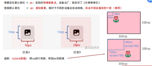
背景图尺寸 – backgroundImageSize
作用:背景图缩放
属性:.backgroundImageSize(宽高对象 或 枚举)
参数:
- 背景图宽高:{ width: 尺寸, height: 尺寸 }
- 枚举 ImageSize:
- Contain:等比例缩放背景图,当宽或高与组件尺寸相同停止缩放
- Cover:等比例缩放背景图至图片完全覆盖组件范围
- Auto:默认,原图尺寸
       Text('我是文本')
          .backgroundImage($r('app.media.img1'))
          .backgroundImageSize({width:250,height:100})
          .backgroundImageSize(ImageSize.Cover)
线性布局
线性布局(LinearLayout)通过线性容器 Column 和 Row 创建。
- Column 容器:子元素 垂直方向 排列
- Row 容器:子元素 水平方向 排列
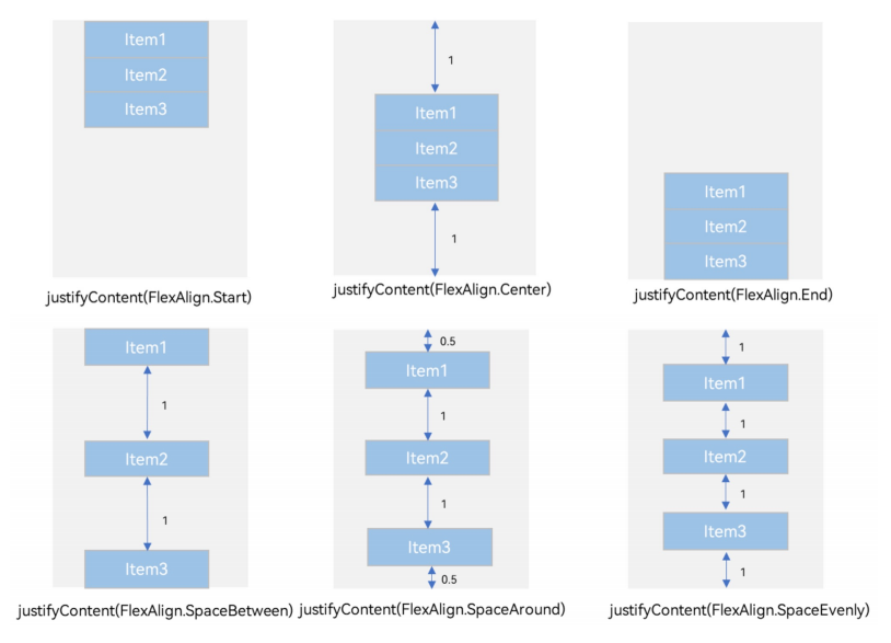
排布主方向上的对齐方式 (主轴)
属性:.justifyContent(枚举FlexAlign) (Row 组件的 justifyContent 属性效果相似)
    build() {
      Column(){
        Text()
          .width(200)
          .height(100)
          .backgroundColor(Color.Pink)
          .border({width:2})
        Text()
          .width(200)
          .height(100)
          .backgroundColor(Color.Pink)
          .border({width:2})
          .margin(5)
        Text()
          .width(200)
          .height(100)
          .backgroundColor(Color.Pink)
          .border({width:2})
          .margin(5)
        Text()
          .width(200)
          .height(100)
          .backgroundColor(Color.Pink)
          .border({width:2})
      }
      .width('100%')
      .height('100%')
      .backgroundColor('#ccc')
      // 设置排布主方向的对齐方式(主轴)
      // 1.Start (排布主方向)主轴起始位置对齐
      // 2.Center 主轴居中对齐
      // 3.End 主轴结束位置对齐
      // 4.SpaceBetween 贴边显示,中间的元素均匀分布间隙
      // 5.SpaceAround 间隙环绕 0.5 1 1 1 0.5 的间隙分布,靠边只有一半的间隙
      // 6.SpaceEvenly 间隙均匀环绕,靠边也是完整的一份间隙
      // justifyContent(枚举FlexAlign)
      .justifyContent(FlexAlign.Start)
build() {
Row(){
Text()
.width(60)
.height(100)
.backgroundColor(Color.Pink)
.border({width:2})
Text()
.width(60)
.height(100)
.backgroundColor(Color.Pink)
.border({width:2})
.margin(5)
Text()
.width(60)
.height(100)
.backgroundColor(Color.Pink)
.border({width:2})
.margin(5)
Text()
.width(60)
.height(100)
.backgroundColor(Color.Pink)
.border({width:2})
}
.width('100%')
.height('100%')
.backgroundColor('#ccc')
// 设置排布主方向的对齐方式(主轴)
// 1.Start (排布主方向)主轴起始位置对齐
// 2.Center 主轴居中对齐
// 3.End 主轴结束位置对齐
// 4.SpaceBetween 贴边显示,中间的元素均匀分布间隙
// 5.SpaceAround 间隙环绕 0.5 1 1 1 0.5 的间隙分布,靠边只有一半的间隙
// 6.SpaceEvenly 间隙均匀环绕,靠边也是完整的一份间隙
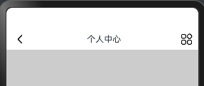
.justifyContent(FlexAlign.SpaceEvenly)个人中心 – 顶部导航案例
@Entry
@Component
struct Index {
  @State message: string = 'Hello World';

  build() {
      Column(){
        Row(){
          Image($r('app.media.ic_public_arrow_left'))
            .width(30)
          Text('个人中心')
          Image($r('app.media.ic_gallery_photoedit_more'))
            .width(24)
        }
        .justifyContent(FlexAlign.SpaceBetween)
        .width('100%')
        .height(40)
        .padding({left:10,right:10} )
        .backgroundColor(Color.White)
      }
      .width('100%')
      .height('100%')
      .backgroundColor('#ccc')
    }
}
交叉轴对齐方式
属性:alignItems()
参数:枚举类型
- 交叉轴在水平方向:HorizontalAlign
- 交叉轴在垂直方向:VerticalAlign
build() {
      Column(){
        Text()
          .width(200)
          .height(100)
          .backgroundColor(Color.Pink)
          .border({width:2})
        Text()
          .width(200)
          .height(100)
          .backgroundColor(Color.Pink)
          .border({width:2})
          .margin({top:5,bottom:5})
        Text()
          .width(200)
          .height(100)
          .backgroundColor(Color.Pink)
          .border({width:2})
      }
      .alignItems(HorizontalAlign.Center)
      .width('100%')
      .height('100%')
      .backgroundColor('#ccc')
    }
build() {
//Row的交叉轴的对齐方式(垂直往下的交叉轴)VerticalAlign
// alignItems(VerticalAlign.Top) Center Bottom
Row(){
Text()
.width(60)
.height(100)
.backgroundColor(Color.Pink)
.border({width:2})
Text()
.width(60)
.height(100)
.backgroundColor(Color.Pink)
.border({width:2})
.margin({left:5,right:5})
Text()
.width(60)
.height(100)
.backgroundColor(Color.Pink)
.border({width:2})
}
.alignItems(VerticalAlign.Top)
.width('100%')
.height('100%')
.backgroundColor('#ccc')
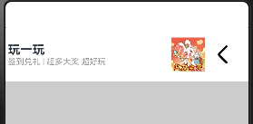
}得物 – 列表项
@Entry
@Component
struct Index {
  @State message: string = 'Hello World';
  //Column 交叉轴的对齐方式(水平往右)
  // alignItems(HorizontalAlign.Start)  Center End
  build() {
    Column({space:8}){
      Row(){
        //左侧列
        Column(){
          Text('玩一玩')
            .fontSize(18)
            .fontWeight(700)
          Text('签到兑礼 | 超多大奖 超好玩')
            .fontSize(12)
            .fontColor('#999')
        }
        .alignItems(HorizontalAlign.Start)
        //右侧行
        Row(){
          Image($r('app.media.img1'))
            .width(50)
          Image($r('app.media.ic_public_arrow_left'))
            .width(50)
        }
      }
      .justifyContent(FlexAlign.SpaceBetween)
      .padding({left:5,right:15})
      .width('100%')
      .height(80)
      .backgroundColor('#fff')
      .borderRadius(5)
    }
    .width('100%')
    .height('100%')
    .backgroundColor('#ccc')
  }
}
自适应伸缩
设置 layoutWeight 属性的 子元素 与 兄弟元素,会 按照权重 进行分配 主轴 的 空间 (剩余空间)
语法:.layoutWeight(数字)
    Row(){
      Text('左侧')
        .layoutWeight(1)
        .height(50)
        .backgroundColor(Color.Pink)
      Text('右侧')
        .width(70)
        .height(50)
        .backgroundColor(Color.Orange)
    }
build() {
Column(){
Row(){
Text('左侧')
.layoutWeight(1)
.height(50)
.backgroundColor(Color.Pink)
Text('右侧')
.width(70)
.height(50)
.backgroundColor(Color.Orange)
}
.width(300)
.height(40)
.backgroundColor('#fff')
Row(){
Text('老大')
.layoutWeight(1)
.height(40)
.backgroundColor(Color.Gray)
Text('老二')
.layoutWeight(1)
.height(40)
.backgroundColor(Color.Brown)
Text('老三')
.layoutWeight(1)
.height(40)
.backgroundColor(Color.Orange)
}
.width(300)
.height(40)
.backgroundColor('#fff')
}
.padding(10)
.width('100%')
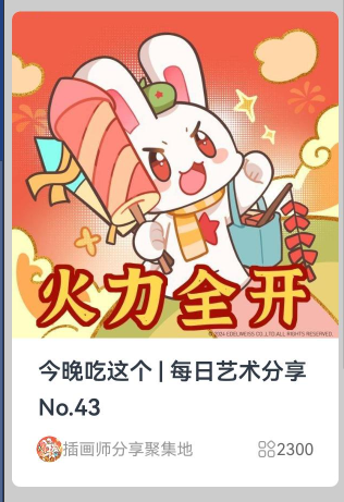
}得物 – 卡片
@Entry
@Component
struct Index {
  @State message: string = 'Hello World';

  build() {
      Column(){
        Column(){
          Image($r('app.media.img1'))
            .width('100%')
            .borderRadius({
              topLeft:5,
              topRight:5
            })
          Text('今晚吃这个 | 每日艺术分享 No.43')
            .fontWeight(600)
            .fontSize(14)
            .lineHeight(22)
            .height(60)

          Row(){
            Row(){
              Image($r('app.media.img1'))
                .width(16)
                .borderRadius(8)
              Text('插画师分享聚集地')
                .fontSize(10)
                .fontColor('#999')
            }
            .layoutWeight(1)

            Row(){
              Image($r('app.media.ic_gallery_photoedit_more'))
                .width(12)
                .fillColor('#999')
              Text('2300')
                .fontSize(10)
                .fontColor('#666')
            }
          }
          .padding({left:15,right:15})
        }

        .width(200)
        .padding({bottom : 15})
        .backgroundColor(Color.White)
        .borderRadius(5)
      }
        .padding(10)
        .width('100%')
        .height('100%')
        .backgroundColor('#ccc')
  }
}
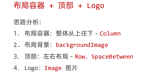
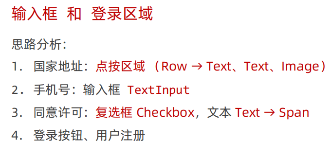
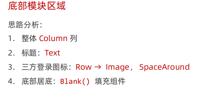
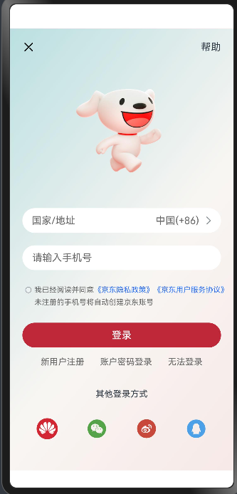
综合案例 – 京东登录
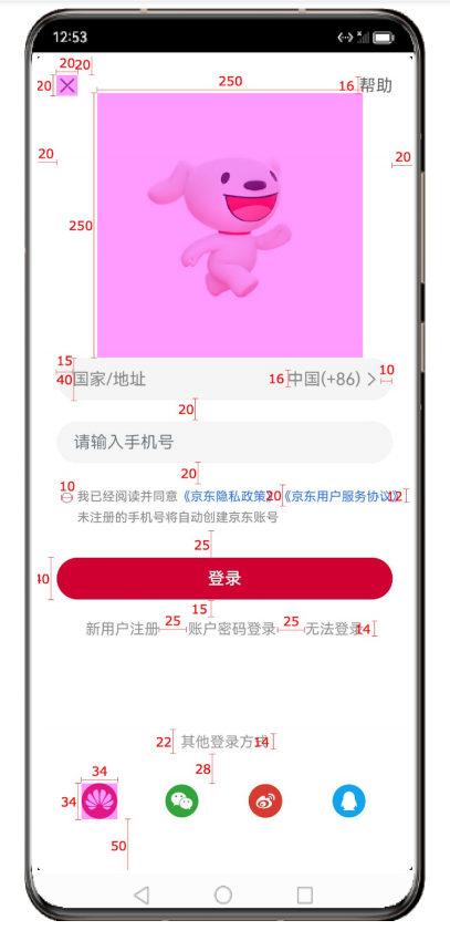
我自己写的
@Entry
@Component
struct Index {
  @State message: string = 'Hello World';

  build() {
      Column(){
        //头部区域
        Row(){
          Image($r('app.media.jd_cancel'))
            .width(25)
          Text('帮助')
            .width(40)
        }
        .width('100%')
        .height(20)
        .justifyContent(FlexAlign.SpaceBetween)
        //中间区域
        Column(){
          Image($r('app.media.jd_logo'))
            .width(250)
            .height(250)
          Text('国家/地址                               中国(+86)')
            .backgroundColor(Color.White)
            .width('100%')
            .height(50)
            .borderRadius(50)
            .padding(15)
          TextInput({
            placeholder:'请输入手机号'
          })
            .backgroundColor(Color.White)
            .margin(20)
            .width('100%')
            .height(50)
            .borderRadius(50)
            .padding(15)

          Row(){
            Text()
              .width(10)
              .height(10)
              .borderRadius(50)
              // .backgroundColor(Color.Red)
              .border({
                width:{
                  left:3,
                  right:3
                },
                color:{
                  left:Color.Gray,
                  right:Color.Gray
                },
                style:{
                  left:BorderStyle.Dashed,
                  right:BorderStyle.Dotted
                }
              })
              Text('我已经阅读同意')
                .fontSize(12)
              Text('《京东隐私政策》')
                .fontSize(12)
                .fontColor(Color.Blue)
              Text('《京东用户服务协议》')
                .fontSize(12)
                .fontColor(Color.Blue)
          }
          Row(){
            Text('未注册的手机号讲自动创建京东账号')
              .fontSize(12)
          }
          Button('登录')
            .width('100%')
            .backgroundColor(Color.Red)
            .margin(25)
        }
          Row(){
            Text('新用户注册')
              .fontSize(14)
              .fontColor(Color.Gray)
              .margin({right:25 })
            Text('账户密码登录')
              .fontSize(14)
              .fontColor(Color.Gray)
              .margin({right:25 })
            Text('无法登录')
              .fontSize(14)
              .fontColor(Color.Gray)
          }
          Row(){
          Text('其他登录方式')
            .fontSize(14)
            .fontColor(Color.Gray)
            .margin({top:50})
          }
          Row(){
            Image($r('app.media.jd_huawei'))
              .width(34)
            Image($r('app.media.jd_wechat'))
              .width(34)
            Image($r('app.media.jd_weibo'))
              .width(34)
            Image($r('app.media.jd_QQ'))
              .width(34)
          }
          .width('100%')
          .justifyContent(FlexAlign.SpaceBetween)
          .margin({
            top:18,
            bottom:50,
            left:50,
            right:50
          })
      }
      .padding(20)
      .width('100%')
      .height('100%')
      .backgroundColor(Color.Pink)
      .backgroundImage($r('app.media.jd_login_bg'))
  }
}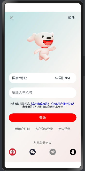
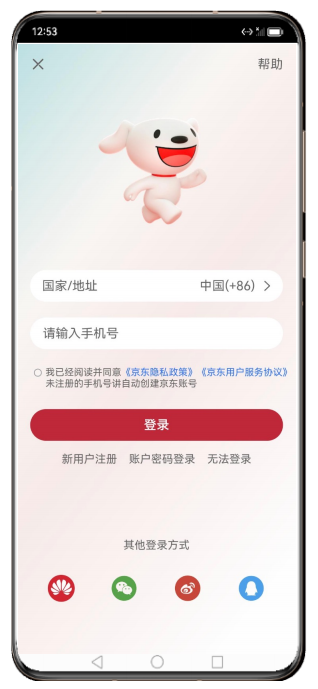
案例
@Entry
@Component
struct Index {
  @State message: string = 'Hello World';

  build() {
      Column(){
        //头部区域
        Row(){
          Image($r('app.media.jd_cancel'))
            .width(20)
          Text('帮助')
        }
        .width('100%')
        .justifyContent(FlexAlign.SpaceBetween)

        Image($r('app.media.jd_logo'))
          .width(250)
          .height(250)
        //中间区域
          Row(){
            Text('国家/地址')
              .layoutWeight(1)
              .fontColor('#666')
            Text('中国(+86)')
              .margin({right:5})
              .fontColor('#666')
            Image($r('app.media.jd_right'))
              .width(20)
          }
            .width('100%')
            .height(40)
            .backgroundColor('#fff')
            .borderRadius(20)
            .padding({left:15,right:10})

          TextInput({
            placeholder:'请输入手机号'
          })
            .placeholderColor('#666')
            .height(40)
            .borderRadius(20)
            .backgroundColor('#fff')
            .margin({top:20})

          Row(){
            Checkbox()
              .width(10)
              .margin({top:7})
            Text('...'){
              Span('我已经阅读并同意')
              Span('《京东隐私政策》')
                .fontColor('#3274f6')
              Span('《京东用户服务协议》')
                .fontColor('#3274f6')
              Span('未注册的手机号将自动创建京东账号')
            }
              .fontSize(12)
              .fontColor('#666')
              .lineHeight(20)
          }
          .alignItems(VerticalAlign.Top)
          .margin({top:20})

          Button('登录')
            .width('100%')
            .backgroundColor('#bf2838')
            .margin({top:25})

          Row({space:25}){
            Text('新用户注册')
              .fontSize(14)
              .fontColor('#666')
            Text('账户密码登录')
              .fontSize(14)
              .fontColor('#666')
            Text('无法登录')
              .fontSize(14)
              .fontColor('#666')
          }
          .margin({top:15})

          //填充组件;作用:填充空白区域(像弹簧)
          Blank()

          Column(){
            Text('其他登录方式')
              .height(22)
              .fontSize(14)
              .margin({bottom:28})
            Row(){
              Image($r('app.media.jd_huawei'))
                  .width(34)
              Image($r('app.media.jd_wechat'))
                  .width(34).fillColor('#56a44a')
              Image($r('app.media.jd_weibo'))
                  .width(34).fillColor('#c8493b')
              Image($r('app.media.jd_QQ'))
                  .width(34).fillColor('#4ba0e8')
            }
            .width('100%')
            .margin({bottom:30})
            .justifyContent(FlexAlign.SpaceAround)
          }
          .width('100%')
      }
      .padding(20)
      .width('100%')
      .height('100%')
      .backgroundColor(Color.Pink)
      .backgroundImage($r('app.media.jd_login_bg'))
  }
}
弹性布局(Flex)
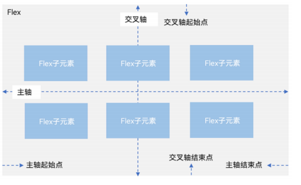
     // 弹性容器组件
     Flex()
    // 基本使用
    Flex(参数对象){
       子组件1
       子组件2
       子组件3
       子组件N
    }
    // 1.主轴方向:direction
    // 2.主轴对齐方式:justifyContent
    // 3.交叉轴对齐方式:alignItems
    // 4.布局换行:wrap
build() {
// Flex默认主轴水平往右,交叉轴垂直往下 > Row、
// 1. 主轴方向
// direction:FlexDirection.Column / Row
// 2.主轴对齐方式
// justifyContent:FlexAlign.SpaceAround
// 3.交叉轴对齐方式
// alignItems:ItemAlign.Stretch / Start / Center / End
// 单行或者单列的情况,优先还是使用线性布局(本质基于Flex设计的,且还做了性能优化)
Flex({
direction:FlexDirection.Column,
justifyContent:FlexAlign.SpaceAround,
alignItems:ItemAlign.Stretch
}){
Text()
.width(80).height(80)
.backgroundColor(Color.Pink)
.border({width:1,color:Color.Blue})
Text()
.width(80).height(80)
.backgroundColor(Color.Pink)
.border({width:1,color:Color.Blue})
Text()
.width(80).height(80)
.backgroundColor(Color.Pink)
.border({width:1,color:Color.Blue})
}
.width('100%')
.height(600)
.backgroundColor('#5f9a5c')
}Flex 换行 – wrap
// 4. 换行 wrap
    // FlexWrap.Wrap 换行
    // FlexWrap.NoWrap 不换行
    Flex({
      wrap: FlexWrap.NoWrap
    }){
      Text()
        .width(80).height(80)
        .backgroundColor(Color.Pink)
        .border({width:1,color:Color.Blue})
      Text()
        .width(80).height(80)
        .backgroundColor(Color.Pink)
        .border({width:1,color:Color.Blue})
      Text()
        .width(80).height(80)
        .backgroundColor(Color.Pink)
        .border({width:1,color:Color.Blue})
      Text()
        .width(80).height(80)
        .backgroundColor(Color.Pink)
        .border({width:1,color:Color.Blue})
      Text()
        .width(80).height(80)
        .backgroundColor(Color.Pink)
        .border({width:1,color:Color.Blue})
    }
    .width(300)
    .height(300)
    .backgroundColor('#5f9a5c')
  }
案例
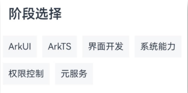
@Entry
@Component
struct Index {
  @State message: string = 'Hello World';

  build() {
   Column(){
     Text('阶段选择')
       .fontSize(30)
       .fontWeight(700)
       .padding(15)
       .width('100%')
     Flex({
       wrap:FlexWrap.Wrap
     }){
       Text('ArkUI').margin(5).padding(10).backgroundColor('#f1f1f1')
       Text('ArkTS').margin(5).padding(10).backgroundColor('#f1f1f1')
       Text('界面开发').margin(5).padding(10).backgroundColor('#f1f1f1')
       Text('系统能力').margin(5).padding(10).backgroundColor('#f1f1f1')
       Text('权限控制').margin(5).padding(10).backgroundColor('#f1f1f1')
       Text('元服务').margin(5).padding(10).backgroundColor('#f1f1f1')
     }
   }
  }
}
绝对定位
绝对定位 – position
作用:控制组件位置,可以实现层叠效果
特点:
- 参照 父组件左上角 进行偏移
- 绝对定位后的组件 不再占用自身原有位置
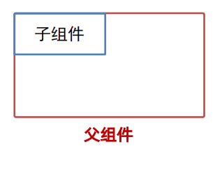
语法:.position(位置对象)
参数:{ x: 水平偏移量, y: 垂直偏移量 }
   Text('文字内容')
    .position({
      x:0,
      y:0
    })
zIndex 层级
作用:调整组件层级
语法:.zIndex(数字)
参数:取值为整数数字,取值越大,显示层级越高
build() {
    // position绝对定位:可以控制组件位置,可以实现层叠效果
    // 特点
    // 1.相对于父组件左顶点进行偏移(调整位置)
    // 2.原本的位置不占了,且可以任意调整位置,不影响其他元素

    //后面的组件明显层级更高,会盖住前面的组件
    //需求:不动结构的情况下,调整组件的层级 .zIndex(数字)
    Column(){
      Text('大儿子')
        .width(80)
        .height(80)
        .backgroundColor(Color.Green)
        .zIndex(1)
      Text('二儿子-定位')
        .width(80)
        .height(80)
        .backgroundColor(Color.Yellow)
        .position({
          x:50,
          y:50
        })
        .zIndex(3)
      Text('三儿子')
        .width(80)
        .height(80)
        .backgroundColor(Color.Orange)
        .zIndex(2)
    }
    .width(300)
    .height(300)
    .backgroundColor(Color.Pink)
  }
案例 卡片《人气热播故事》
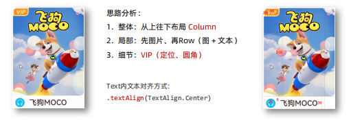
@Entry
@Component
struct Index {
  @State message: string = 'Hello World';

  build() {
    Column(){
      Column(){
        Text('VIP')
          .position({x:0,y:0})
          .zIndex(666)
          .width(40)
          .height(20)
          .backgroundColor("#e49642")
          .borderRadius({
            topLeft:10,
            bottomRight:10
          })
          .border({width:2,color:'#fbe7a3'})
          .fontColor('#fbe7a3')
          .fontStyle(FontStyle.Italic)
          .fontSize(14)
          .fontWeight(700)
          .textAlign(TextAlign.Center)
        Image($r('app.media.position_moco'))
          .width('100%')
          .height(210)
          .borderRadius(10)
        Row(){
         Image($r('app.media.position_earphone'))
           .width(20)
           .backgroundColor('#55b7f4')
           .borderRadius(10)
           .padding(3)
           .fillColor(Color.White)
           .margin({left:6,right:6})
          Text('飞狗MOCO')
            .fontWeight(700)
        }
        .height(30)
        .width('100%')
      }
      .width(160)
      .height(240)
    }
    .width('100%')
    .height('100%')
  }
}
层叠布局
层叠布局具有较强的组件层叠能力。场景:卡片层叠效果等
特点:层叠操作更简洁,编码效率高。(绝对定位的优势是更灵活)
Stack 容器内的⼦元素的顺序为 Item1 -> Item2 -> Item3
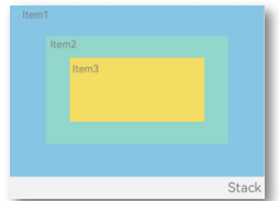
    // 语法
    Stack(){
      Item1()
      Item1()
      Item1()
    }

    Stack({
      alignContent:Alignment.Center
    }){
      Item1()
      Item1()
      Item1()
}特点:层叠操作更简洁,编码效率高。
(绝对定位的优势是更灵活)
   //例子
   Stack({
      alignContent:Alignment.Center
    }){
      Text('1')
        .width(250)
        .height(250)
        .backgroundColor(Color.Green)
        .zIndex(3)
      Text('2')
        .width(150)
        .height(150)
        .backgroundColor(Color.Orange)
        .zIndex(4)
      Text('3')
        .width(50)
        .height(50)
        .backgroundColor(Color.Yellow)
        .zIndex(5)
    }
    .width(300)
    .height(600)
    .backgroundColor(Color.Pink)
综合案例-B站-视频卡片
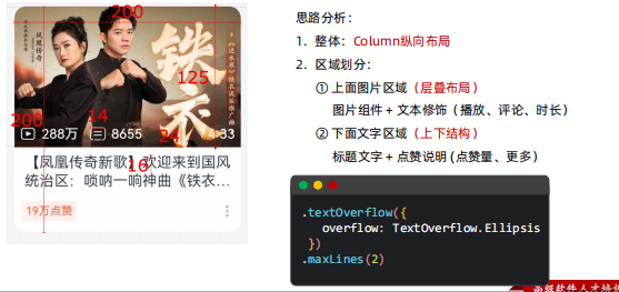
@Entry
@Component
struct Index {
@State message: string = 'Hello World';
build() {
Column(){
Column(){
// 图片区域
Stack({alignContent:Alignment.Bottom}){
Image($r('app.media.bz_img'))
.borderRadius({
topLeft:10,
topRight:10
})
Row(){
Row({space:5}){
Image($r('app.media.bz_play'))
.width(14)
.fillColor(Color.White)
Text('288万')
.fontSize(12)
.fontColor(Color.White)
}
.margin({right:10})
Row({space:5}){
Image($r('app.media.bz_msg'))
.width(14)
.fillColor(Color.White)
Text('8655')
.fontSize(12)
.fontColor(Color.White)
}
Blank()
Text('4:33')
.fontSize(12)
.fontColor(Color.White)
}
.height(24)
.padding({left:5,right:5})
.width('100%')
}
.width('100%')
.height(125)
Column(){
Text('【凤凰传奇新歌】欢迎来到国风统治区:唢呐一响神曲《铁衣流派推广曲》')
.fontSize(13)
.lineHeight(16)
.textOverflow({overflow:TextOverflow.Ellipsis})
.maxLines(2)
Row(){
Text('19万点赞')
.fontSize(10)
.fontColor('#e66c43')
.backgroundColor('#fef0ef')
.padding(5)
.borderRadius(2)
Image($r('app.media.bz_more'))
.width(14)
}
.margin({top:6})
.width('100%')
.justifyContent(FlexAlign.SpaceBetween)
}
}
.width(200)
.height(200)
.backgroundColor(Color.White)
.borderRadius(10)
.margin({top:10})
}
.width('100%')
.height('100%')
.backgroundColor('#ccc')
}
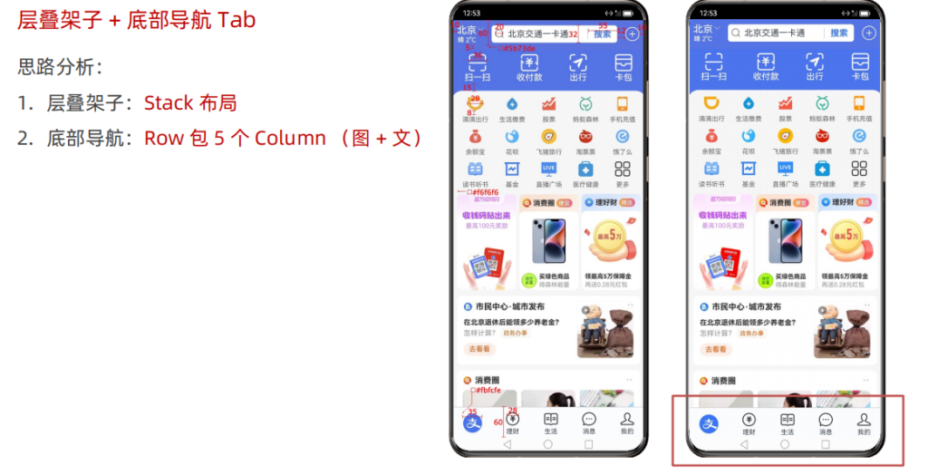
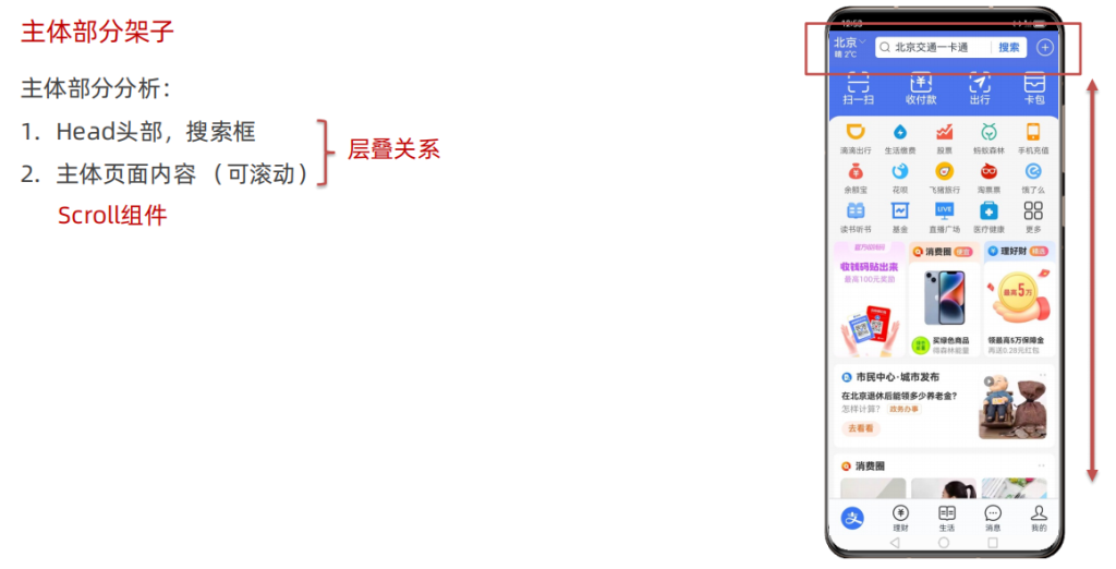
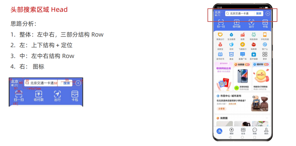
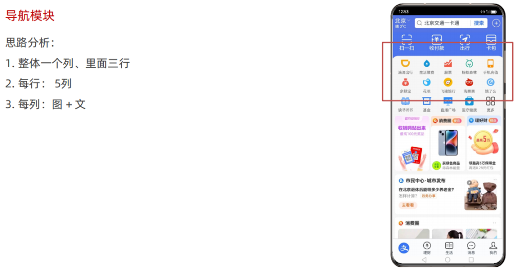
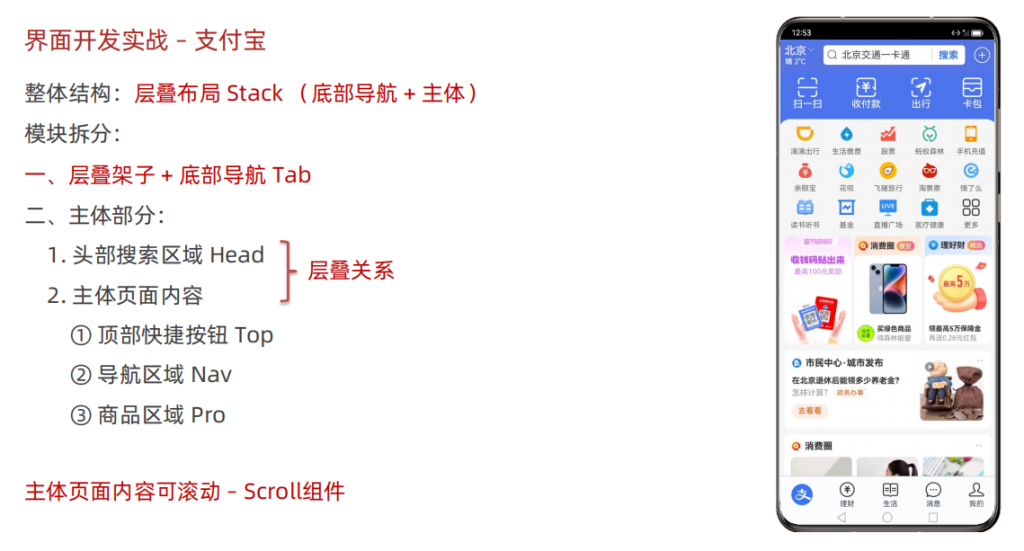
}界面开发实战 – 支付宝
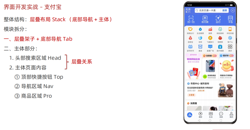
@Entry
@Component
struct Index {
  @State message: string = 'Hello World';

  build() {
    Column(){
      // 1. 整体Stack布局 + 底部的ta
      // 2. 主体区域的架子:头部 + 主体页面(层叠关系、主体页面可以滚动)
      //    Column/Row,默认不具备可滚动的效果 > Scroll
      // 3. Head头部区域:左 中 右 三部分
      // 4. Top快捷按钮区域:Row里面有4个Colum
      // 5. Nav导航区域
      Stack({alignContent:Alignment.Bottom}){
        //主体展示区
        Stack({alignContent:Alignment.Top}){
          //头部
          Row(){
            //左边
            Column(){
              Text('北京').fontSize(18).fontColor('#fff')
              Text('晴 2°C').fontSize(12).fontColor('#fff')
              Image($r('app.media.zfb_head_down'))
                .position({
                  x:40,
                  y:0
                })
                .width(12)
                .fillColor('#fff')
            }
            //中间
            Row(){
              Image($r('app.media.zfb_head_search'))
                .width(20)
                .fillColor('#666')
                .margin({left:5,right:5})
              Text('北京交通一卡通')
                .layoutWeight(1)
              Text('搜索')
                .width(55)
                .fontColor('#5b73de')
                .fontWeight(700)
                .textAlign(TextAlign.Center)
                .border({
                  width:{left:1},
                  color:'#ccc'
                })
            }
            .height(32)
            .layoutWeight(1)
            .backgroundColor('#fff')
            .borderRadius(5)
            .margin({left:25,right:12})
            //右边
            Image($r('app.media.zfb_head_plus'))
              .width(30)
              .fillColor('#fff')
          }
          .padding({left:10,right:10})
          .width('100%')
          .height(60)
          .backgroundColor('#5b73de')
          .zIndex(666)
          //主体页面

          Scroll(){
            Column(){
            //Top快捷按钮区域
              Row(){
                Column(){
                  Image($r('app.media.zfb_top_scan'))
                    .width(36)
                    .fillColor('#fff')
                  Text('扫一扫')
                    .fontColor('#fff')
                }
                .layoutWeight(1)
                Column(){
                  Image($r('app.media.zfb_top_pay'))
                    .width(36)
                    .fillColor('#fff')
                  Text('首付款')
                    .fontColor('#fff')
                }
                .layoutWeight(1)
                Column(){
                  Image($r('app.media.zfb_top_travel'))
                    .width(36)
                    .fillColor('#fff')
                  Text('出行')
                    .fontColor('#fff')
                }
                .layoutWeight(1)
                Column(){
                  Image($r('app.media.zfb_top_card'))
                    .width(36)
                    .fillColor('#fff')
                  Text('卡包')
                    .fontColor('#fff')
                }
                .layoutWeight(1)
              }
              .backgroundColor('#5b73de')
              .padding({top:5,bottom:15})

            //   主体区域
              Column(){
                //导航区
                Column({space:10}){
                  Row(){
                    Column(){
                      Image($r('app.media.zfb_nav1'))
                        .width(28).margin({bottom:8})
                      Text('滴滴出行')
                        .fontSize(12).fontColor('#666')
                    }
                    .layoutWeight(1)
                    Column(){
                      Image($r('app.media.zfb_nav2'))
                        .width(28).margin({bottom:8})
                      Text('生活缴费')
                        .fontSize(12).fontColor('#666')
                    }
                    .layoutWeight(1)
                    Column(){
                      Image($r('app.media.zfb_nav3'))
                        .width(28).margin({bottom:8})
                      Text('股票')
                        .fontSize(12).fontColor('#666')
                    }
                    .layoutWeight(1)
                    Column(){
                      Image($r('app.media.zfb_nav4'))
                        .width(28).margin({bottom:8})
                      Text('蚂蚁森林')
                        .fontSize(12).fontColor('#666')
                    }
                    .layoutWeight(1)
                    Column(){
                      Image($r('app.media.zfb_nav5'))
                        .width(28).margin({bottom:8})
                      Text('手机充值')
                        .fontSize(12).fontColor('#666')
                    }
                    .layoutWeight(1)
                  }
                  Row(){
                    Column(){
                      Image($r('app.media.zfb_nav6'))
                        .width(28).margin({bottom:8})
                      Text('余额宝')
                        .fontSize(12).fontColor('#666')
                    }
                    .layoutWeight(1)
                    Column(){
                      Image($r('app.media.zfb_nav7'))
                        .width(28).margin({bottom:8})
                      Text('花呗')
                        .fontSize(12).fontColor('#666')
                    }
                    .layoutWeight(1)
                    Column(){
                      Image($r('app.media.zfb_nav8'))
                        .width(28).margin({bottom:8})
                      Text('飞猪旅行')
                        .fontSize(12).fontColor('#666')
                    }
                    .layoutWeight(1)
                    Column(){
                      Image($r('app.media.zfb_nav9'))
                        .width(28).margin({bottom:8})
                      Text('淘票票')
                        .fontSize(12).fontColor('#666')
                    }
                    .layoutWeight(1)
                    Column(){
                      Image($r('app.media.zfb_nav10'))
                        .width(28).margin({bottom:8})
                      Text('饿了么')
                        .fontSize(12).fontColor('#666')
                    }
                    .layoutWeight(1)
                  }
                  Row(){
                    Column(){
                      Image($r('app.media.zfb_nav11'))
                        .width(28).margin({bottom:8})
                      Text('读书听书')
                        .fontSize(12).fontColor('#666')
                    }
                    .layoutWeight(1)
                    Column(){
                      Image($r('app.media.zfb_nav12'))
                        .width(28).margin({bottom:8})
                      Text('基金')
                        .fontSize(12).fontColor('#666')
                    }
                    .layoutWeight(1)
                    Column(){
                      Image($r('app.media.zfb_nav13'))
                        .width(28).margin({bottom:8})
                      Text('直播广场')
                        .fontSize(12).fontColor('#666')
                    }
                    .layoutWeight(1)
                    Column(){
                      Image($r('app.media.zfb_nav14'))
                        .width(28).margin({bottom:8})
                      Text('医疗健康')
                        .fontSize(12).fontColor('#666')
                    }
                    .layoutWeight(1)
                    Column(){
                      Image($r('app.media.zfb_nav15_more'))
                        .width(28).margin({bottom:8})
                      Text('更多')
                        .fontSize(12).fontColor('#666')
                    }
                    .layoutWeight(1)
                  }
                }
                .padding(10)

              //   产品区
                Row({space:5}){
                  Image($r('app.media.zfb_pro_pic1'))
                    .layoutWeight(1)
                  Image($r('app.media.zfb_pro_pic2'))
                    .layoutWeight(1)
                  Image($r('app.media.zfb_pro_pic3'))
                    .layoutWeight(1)
                }
                .padding(10)

                Column({space:10}){
                  Image($r('app.media.zfb_pro_list1'))
                    .width('100%')
                  Image($r('app.media.zfb_pro_list2'))
                    .width('100%')
                }
                .padding(10)
              }
              .width('100%')
              .backgroundColor('#fff')
              .borderRadius({
                topLeft:20,
                topRight:20
              })
            }
            .width('100%')
            .padding({top:60,bottom:60})
          }


        }
        .width('100%')
        .height('100%')

        //底部Tab导航区
        Row(){
          Column(){
            Image($r('app.media.zfb_tab_home'))
              .width(35)
          }
          .layoutWeight(1)
          Column(){
            Image($r('app.media.zfb_tab_money'))
              .width(35)
            Text('理财')
              .fontSize(12)
          }
          .layoutWeight(1)
          Column(){
            Image($r('app.media.zfb_tab_life'))
              .width(35)
            Text('生活')
              .fontSize(12)
          }
          .layoutWeight(1)
          Column(){
            Image($r('app.media.zfb_tab_chat'))
              .width(35)
            Text('消息')
              .fontSize(12)
          }
          .layoutWeight(1)
          Column(){
            Image($r('app.media.zfb_tab_me'))
              .width(35)
            Text('我的')
              .fontSize(12)
          }
          .layoutWeight(1)
        }
        .width('100%')
        .height(60)
        .backgroundColor('#fbfcfe')
      }
      .width('100%')
      .height('100%')
      .backgroundColor('#5b73de')
    }
  }
 }
字符串拼接
作用:把两个或多个字符串,拼成一个字符串。(通常拼接的是字符串和变量)
    // 加号的作用:拼接
    'hello' + 'world' => 'helloworld'

    let name:string ='小明'
    console.log('简介信息','名字是' + name)
注意: 加法两端只要有字符串,就是拼接
模板字符串
模板字符串 `hello`
作用:拼接字符串和变量
优势:更适合于 多个变量 的字符串拼接
    // 复杂场景
    let name: string = '小明'
    let age: number = 18
    console.log('简介信息',`姓名是${name},今年${age}岁了`)

    // 简易场景
    let name: string = '小明'
    let age: number = 18
    console.log('简介信息','姓名是$'+ name',今年' + age '岁了')
类型转换(数字和字符串)
1. 字符串转数字
Number():字符串 直接转数字,转换失败返回NaN(字符串中包含非数字)
parseInt():去掉小数部分 转数字,转换失败返回NaN
parseFloat():保留小数部分 转数字,转换失败返回NaN
let str1: string= '1.1'
let str2: string= '1.9'
let str3: string= '1.1a'
let str4: string= 'a'

console.log('数字是',Number(str1));
console.log('数字是',Number(str2));
console.log('数字是',Number(str3));
console.log('数字是',parseInt(str1));
console.log('数字是',parseInt(str2));
console.log('数字是',parseInt(str3));
console.log('数字是',parseInt(str4));
console.log('数字是',parseFloat(str1));
console.log('数字是',parseFloat(str2));
console.log('数字是',parseFloat(str3));
console.log('数字是',parseFloat(str4));
2. 数字转字符串
toString():数字直接转字符串
toFixed():四舍五入转字符串,可设置保留几位小数
let num1:number = 1.1
let num2:number = 1.9
let num3:number = 1.9152

console.log('字符串是',num1.toString())
console.log('字符串是',num2.toString())
console.log('字符串是',num1.toFixed())
console.log('字符串是',num2.toFixed())
console.log('字符串是',num3.toFixed(2))
交互 – 点击事件
说明:组件 被点击时 触发的事件
作用:监听(感知)用户 点击行为,进行对应操作
语法:onClick( (参数) => {} )
    // 语法
    Button('点我,显示弹框')
      .onClick(()=>{
        AlertDialog.show({
          message:'你好-这是一个弹窗'
        })
      })
状态管理
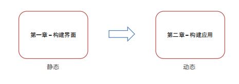
之前构建的页面多为静态界面
但如果希望构建一个动态的、有交互的界面,就需要引入“状态”的概念
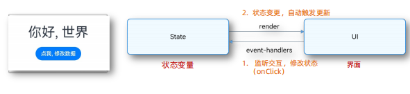
点击交互 触发了 文本状态变更,状态变更 引起了 UI渲染
普通变量:只能在初始化时渲染,后续将不会再刷新。
状态变量:需要装饰器装饰,改变会引起 UI 的渲染刷新 (必须设置 类型 和 初始值)
//普通变量
let msg1: string = '黑马程序员'

@Entry
@Component
struct Index {
  msg2: string = 'Hello World';

  build() {
    Column(){
      Text(msg1)
      Text(this.msg2)
    }
  }
 }
//状态变量
@Entry
@Component
struct Index {
  @State msg3: string = 'Hello World';

  build() {
    Column(){
      Text(this.msg3)
        .onClick(()=>{
          this.msg3 = '你好,世界'
        })
    }
  }
 }
// 例子
// 注意点
// 1. 普通变量,只能在初始化时渲染,后续变化了,也不会引起更新
// 2. 状态变量,被装饰器修饰,值的改变,会【自动】引起界面的更新
let myName: string = '吕布'
@Entry
@Component
struct Index {
//组件内的普通变量
myAge:number = 18
// 组件内的状态变量
@State myMsg: string = '你好'
build() {
Column(){
Text(myName).onClick(() => {
myName = '貂蝉'
console.log('myName',myName);
})
Text(this.myAge.toString()).onClick(()=>{
this.myAge = 200
console.log('myAge',this.myAge)
})
Text(this.myMsg).onClick(()=>{
this.myMsg = '你好,状态'
})
}
}
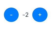
}案例 计数器案例
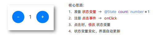
//计数器案列
@Entry
@Component
struct Index {
  //状态变量
  @State count:number = 1
  build() {
    Row(){
      Button('-')
        .onClick(()=>{
          this.count = this.count - 1
        })
      Text(this.count.toString())
        .margin(10)
      Button('+')
        .onClick(()=>{
          // 只要修改了状态变量,自动触发界面(视图)的更新
          this.count = this.count + 1
        })
    }
    .padding(20)
  }
}
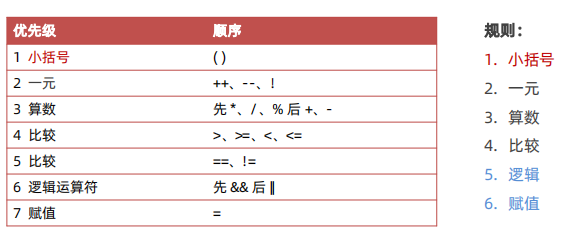
运算符
算数运算符
算术运算符:也叫数学运算符,主要包括加、减、乘、除、取余(求模)等
| 算数运算符 | 作用 |
| + | 加法运算 |
| – | 减法运算 |
| * | 乘法运算 |
| / | 除法运算 |
| % | 取余(求模) |
let num1: number = 9
let num2: number = 4

console.log('加法计算',num1 + num2)
console.log('减法计算',num1 - num2)
console.log('乘法计算',num1 * num2)
console.log('除法计算',num1 / num2)
console.log('取余计算',num1 % num2)
赋值运算符
| 赋值运算符 | 作用 |
| += | 加法赋值 |
| -= | 减法赋值 |
| *= | 乘法赋值 |
| /= | 除法赋值 |
| %= | 取余赋值 |
let num1: number = 1

num1 += 1

console.log('加等后的结果', num1)
案例 点赞案例
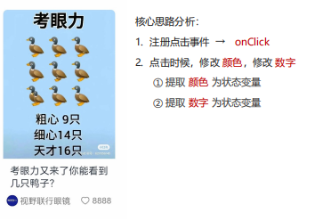
@Entry
@Component
struct Index {
  //声明状态 颜色 点赞数
  @State myColor: string = '#7e7e7e'
  @State myCount: number = 8888
  build() {
    Column(){
      Column(){
        Image($r('app.media.eyes'))
          .width('100%')
          .borderRadius({topLeft:6,topRight:6})
        Text('考眼力又来了你能看到几只鸭子?')
          .fontSize(14)
          .lineHeight(18)
          .padding({left: 5, right: 5})
        Row(){
          Text(){
            ImageSpan($r('app.media.avatar'))
              .width(16)
              .margin({right: 3})
            Span('视野联行眼镜')
              .fontSize(12)
              .fontColor('#7e7e7e')
          }
          Row() {
            Image($r('app.media.ic_love'))
              .margin({right: 3})
              .width(14)
              .fillColor(this.myColor)
            Text(this.myCount.toString())
              .fontSize(12)
              .fontColor(this.myColor)
          }
          .onClick(()=>{
            this.myCount += 1
            this.myColor = '#ff0000'
          })
        }
        .width('100%')
        .justifyContent(FlexAlign.SpaceBetween)
        .padding({left: 5, right: 5})
      }
      .width('50%')
    }
    .padding(20)
  }
}
一元运算符
常见一元运算符:++ 和 —
- 后置写法:先赋值后自增/自减
- 前置写法:先自增/自减再赋值
let num:number = 10
let res:number = num++ //后自增

let num2:number = 10
let res2:number = ++num //先自增
比较运算符
作用:用来 判断比较 两个数据 大小,返回一个布尔值(true / false)
| 赋值运算符 | 作用 |
| > | 判断大于 |
| >= | 判断大于等于 |
| < | 判断小于 |
| <= | 判断小于等于 |
| == | 判断相等 |
| != | 判断不相等 |
let num1:number = 9
let num2:number = 5

console.log('比较运算的结果是',num1 > num2)
console.log('比较运算的结果是',num1 >= num2)
console.log('比较运算的结果是',num1 == num2)
console.log('比较运算的结果是',num1 != num2)
逻辑运算符
作用:扩充判断条件
| 逻辑运算符 | 作用 |
| && | 与,都真才真 |
| || | 或,一真则真 |
| ! | 非,取反 |
let num1:number =9
let num2:number =5
let num3:number =3

console.log('结果是',num1 > num2 && num2 > num3)
console.log('结果是',num1 > num2 && num2 < num3)
console.log('结果是',num1 > num2 || num2 < num3)
console.log('结果是',!true)
运算符优先级
综合案例 – 美团购物车
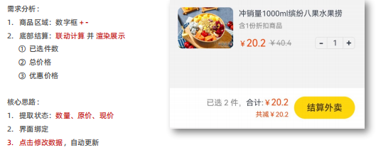
@Entry
@Component
struct Index {
  //1. 提确状态:数量、原价、现价
  //2. 结合状态渲染
  //3. 修改状态,界面自动更新

  @State count: number = 1
  @State oldPrice:number = 40.4
  @State newPrice:number = 10.4

  build() {
    Column() {
      Column() {
        // 产品
        Row({ space: 10}){
          // 图片
          Image($r('app.media.product1'))
            .width(100)
            .borderRadius(8)
          // 文字
          Column({space: 10}) {
            Column({ space: 6}) {
              Text('冲销量1000ml缤纷八果水果捞')
                .lineHeight(20)
                .fontSize(14)
              Text('含1份折扣商品')
                .fontSize(12)
                .fontColor('#7f7f7f')
            }
            .width('100%')
            .alignItems(HorizontalAlign.Start)
            Row(){
              // 价格
              Row({ space: 5}) {
                Text() {
                  Span('¥')
                    .fontSize(14)
                  Span(this.newPrice.toFixed(2))
                    .fontSize(18)
                }
                .fontColor('#ff4000')
                Text() {
                  Span('¥')
                  Span(this.oldPrice.toFixed(2))
                }
                .fontSize(14)
                .fontColor('#999')
                .decoration({type: TextDecorationType.LineThrough, color: '#999'})
              }
              // 加减
              Row() {
                Text('-')
                  .width(22)
                  .height(22)
                  .border({width:1, color: '#e1e1e1', radius: {topLeft: 5, bottomLeft: 5}})
                  .textAlign(TextAlign.Center)
                  .fontWeight(700)
                  .onClick(()=>{
                    this.count--
                  })
                Text(this.count.toString())
                  .height(22)
                  .border({width: { top:1, bottom: 1 }, color: '#e1e1e1'})
                  .padding({left: 10, right: 10})
                  .fontSize(14)
                Text('+')
                  .width(22)
                  .height(22)
                  .border({width:1, color: '#e1e1e1', radius: {topRight: 5, bottomRight: 5}})
                  .textAlign(TextAlign.Center)
                  .fontWeight(700)
                  .onClick(()=>{
                    this.count++
                  })
              }
            }
            .width('100%')
            .justifyContent(FlexAlign.SpaceBetween)
          }
          .height(75)
          .layoutWeight(1)
          .justifyContent(FlexAlign.SpaceBetween)
        }
        .width('100%')
        .alignItems(VerticalAlign.Top)
        .padding(20)

        // 结算
        Row({ space: 10 }){
          // 价格
          Column({space: 5}) {
            Text() {
              Span(`已选 ${this.count} 件,`)
                .fontColor('#848484')
              Span('合计:')
              Span('¥')
                .fontColor('#fd4104')
              Span((this.count * this.newPrice).toFixed(2))
                .fontColor('#fd4104')
                .fontSize(16)
            }
            .fontSize(14)
            Text('共减'+ (this.count * (this.oldPrice - this.newPrice)).toFixed(2))
              .fontColor('#fd4104')
              .fontSize(12)
          }
          .alignItems(HorizontalAlign.End)
          // 结算按钮
          Button('结算外卖')
            .width(110)
            .height(40)
            .backgroundColor('#fed70e')
            .fontColor('#564200')
            .fontSize(16)
            .fontWeight(600)
        }
        .width('100%')
        .height(70)
        .backgroundColor('#fff')
        .position({x:0, y: '100%'})
        .translate({y: '-100%'})
        .padding({ left: 20, right: 20 })
        .justifyContent(FlexAlign.End)
      }
    }
    .width('100%')
    .height('100%')
    .backgroundColor('#f3f3f3')
  }
}
数组的操作
主要针对数组中的数据进行 查找、修改、增加 或 删除
| 操作 | 语法 |
| 查找 | 数组名[下标]、数组名.length |
| 修改 | 数组名[下标] = 新值 |
| 增加 | 数组名.push(数据1, 数据2, …)、 数组名.unshift(数据1, 数据2, …) |
| 删除 | 数组名.pop()、数组名.shift() |
| 任意位置增加或删除 | 数组名.splice(操作的起始位置, 删除的个数, 新增1, 新增2, ……) |
查找: 数组名[下标]
修改: 数组名[下标] = 新值
数组长度:数组名.length
let names: string[] = ['小明','小红','大强','小飞']

// 1.查找
console.log('查找姓名',names[0])
// 2.长度
console.log('数组长度为',names.length)
// 3.修改
names[1] = 'Jack'
console.log('Names数组',names)
增加数组元素
往开头加: 数组名.unshift(数据1, 数据2, 数据3, ……)
结尾添加:数组名.push(数据1, 数据2, 数据3, ……)
let songs: string[] = ['告白气球','洋葱','吻别']
// unshift():开头新增 (返回操作后数组的长度)
songs.unshift('你是我的眼')
// push():结尾新增 (返回操作后数组的长度)
songs.push('光辉岁月','天空')

console.log('数组songs',songs)
删除数组元素
从开头删: 数组名.shift()
从结尾删: 数组名.pop()
let songs: string[] = ['告白气球', '洋葱', '吻别']
// shift(): 开头删除 (返回值: 删除的项)
songs.shift()
// pop(): 结尾删除 (返回值: 删除的项)
songs.pop()
console.log('数组songs', songs)
任意位置添加 / 删除数组元素
语法:数组名.splice(起始位置, 删除的个数, 新增元素1, 新增元素2, ……)
let songs: string[] = ['告白气球','洋葱','吻别']
//删除下标为2的元素  ['告白气球','洋葱']
songs.splice(2,1)

console.log('数组songs',songs)
语句
语句: 一段可以执行的代码,是一个行为 ( num = a + b )
表达式: 可以 被求值 的代码,并将其计算出 一个结果 (1 + 1、3 * 5、3 > 2)
语句执行结构:
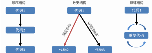
分支语句
if 分支语句
if 分支语句:根据 逻辑条件 不同,执行不同语句。
// 单分支语法
if (逻辑条件){
  条件成立执行的代码
}
let score: number = 82
if (score >= 80){
console.log('单分支:','分数大于80,周末可以去游乐园')
}- 小括号条件结果为 true,则执行大括号里面的代码
- 小括号结果不是布尔类型时,会类型转换为布尔值
// 多分支语法
if(逻辑条件){
  条件成立执行的代码
}
 else{
   条件不成立执行的代码
 }
// 如果分数大于80,才能奖励[周末去游乐园]
let score: number = 56
if (score >= 80){
console.log('通过','分数大于80,周末可以去游乐园')
}
else {
console.log('不通过','分析问题,写个检讨')
}案例 – 购物车数字框
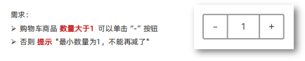
@Entry
@Component
struct Index {
  @State cont: number = 1
  build() {
    Column() {
      Row() {
        Text('-')
          .width(40)
          .height(40)
          .border({width: 2, color: '#999', radius: {topLeft: 3, bottomLeft:3}})
          .textAlign(TextAlign.Center)
          .onClick(()=>{
            if (this.cont>1) {
              this.cont--
            }
            else {
              AlertDialog.show({
                message: '只能减到1'
              })
            }
          })

        Text(this.cont.toString())
          .height(40)
          .padding({left: 20, right: 20 })
          .border({width: {top: 2, bottom: 2}, color: '#999'})
          .fontSize(14)

        Text('+')
          .width(40)
          .height(40)
          .border({width: 2, color: '#999', radius: {topRight: 3, bottomRight: 3}})
          .textAlign(TextAlign.Center)
          .onClick(()=>{
            this.cont++
          })
      }
    }
    .padding(20)
  }
}
if多分支
if 多分支,可以解决多种分支的情况
//多分支语法
if (条件1){
  条件1成立执行的代码
}
else if (条件2){
  条件2成立执行的代码
}
else if (条件3){
  条件3成立执行的代码
}
else {
  都不成立执行的代码
}
let score:number=66
if (score>=90){
console.log('优秀')
}else if (score>=70){
console.log('良好')
}else if (score>=60){
console.log('及格')
}else{
console.log('不及格')
}if 多分支 – 小作业
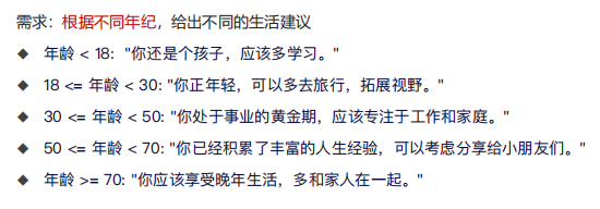
let age: number =18

if (age<18){
  console.log('你还是个孩子,应该多学习')
}else if(age<30){
  console.log('你正年轻,可以多去旅⾏,拓展视野')
}else if(age<50){
  console.log('你处于事业的⻩⾦期,应该专注于⼯作和家庭。')
}else if(age<70){
  console.log('你已经积累了丰富的⼈⽣经验,可以考虑分享给⼩朋友们。')
}else{
  console.log('你应该享受晚年⽣活,多和家⼈在⼀起')
}
switch 分支
switch 分支一般用于精确匹配,不同的值执行不同的代码
// switch语法
switch (表达式) {
  case 值1:
    与值1匹配执行的语句
    break
  case 值2:
    与值2匹配执行的语句
    break
  default:
    以上都未成功匹配执行的代码
}
let fruit:string = '苹果'
switch (fruit){
case '苹果':
console.log('苹果:','2.8元1斤')
break
case '鸭梨':
console.log('鸭梨:','5.5元1斤')
break
case '西瓜':
console.log('西瓜:','1.9元1斤')
break
default:
console.log('提示:','没有你要的水果,请重新输入')
}注意:如果没有break语句,则会直接执行 switch 中的下一个代码块(无论是否匹配成功)
三元条件表达式
语法:条件 ?条件成立执行的表达式 :条件不成立执行的表达式
let num1:number=5
let num2:number=10
// 返回较大值
let res: number=num1>num2 ? num1:num2
console.log('结果是',res)
条件渲染
条件渲染:使用 if、else 和 else if ,可基于 不同状态 渲染 对应不同 UI 内容。